
Recipe
Stamps: Sweet Love (Papertrey Ink)
Cardstock: white stamper's select (Papertrey Ink)
Ink: sweet blush (Papertrey Ink), L'Amour Red (Palette)
Accents: twill
Tools: nestability dies, hole punch
Friday, May 30, 2008
Sending My Love
Posted by Niki Estes at Friday, May 30, 2008 8 comments
Labels: Cards, Papertrey stamps
Thursday, May 29, 2008
Happy Birthday

I think what I love about this set is that it is gender neutral. You can use it to make boy or girl cards just by changing your colors.
I started out by picking my colors for my card. Then, I stamped and cut out my images. I colored them with copic markers. Then, I cut my card base and layers. I assembled the layers (and pierced the holes in my image's mat) and added the ribbon. I added the images using dimensional adhesive. I stamped the sentiment below my ribbon. Last, I added stickles to the cupcake frosting.
The blog hop last night was a blast. Thanks to everyone who stopped by and for all the inspiration on so many of your blogs!
Recipe
Stamps: It's My Birthday (CC Designs), Things Hanna Would Say (Hanna Stamps)
Cardstock: wild wasabi, pretty in pink (SU!), white stamper's select (Papertrey Ink)
Patterned Paper: wild wasabi (SU!)
Ink: graphite black (Brilliance), Noir (Palette)
Accents: wild wasabi ribbon (SU!)
Tools: copic markers, nestability dies, paper piercer, stickles
Posted by Niki Estes at Thursday, May 29, 2008 5 comments
Labels: Cards, CC Designs Stamps
Monday, May 26, 2008
This hugs for you!

I started my card by cutting out a circle using one of my nestability dies and stamping my image. Then, I colored my monkey using prismacolor pencils and canola oil.
My layers are pretty self explanatory. That has me thinking. Do you prefer it when I explain every little detail about how I made the card or is it enough with the recipes? I would love to know which everyone prefers.
Have a great Memorial Day if you're in the US and a great day if you're not!
Recipe
Stamps: Monkey Love (CC Designs)
Cardstock: close to cocoa, creamy caramel, soft sky (SU!), white stamper's select (Papertrey Ink)
Patterned Paper: DCWV
Accents: soft sky ribbon (SU!)
Tools: prismacolor pencils, swiss dots embossing folder, nestability dies
Posted by Niki Estes at Monday, May 26, 2008 12 comments
Labels: Cards, CC Designs Stamps
Friday, May 23, 2008
Fishing Riley
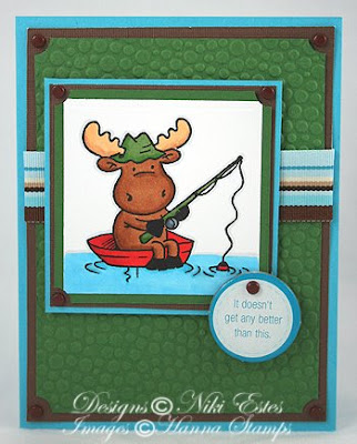
Hope you join us for the challenge!
Recipe
Stamps: Fishing Riley (Hanna Stamps)
Cardstock: white stamper's select (Papertrey Ink), garden green, tempting turquoise (SU!), chocolate (DCWV)
Accents: ribbon, chipboard, brads
Tools: copic markers, ticket corner punch (SU!), embossing folder, nestability die
Posted by Niki Estes at Friday, May 23, 2008 2 comments
Labels: Cards, Hanna stamps
Thursday, May 22, 2008
Copic Marker Tutorial
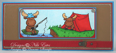
I just love the Riley moose stamps! They are some of my favorite stamps to color and I'm always ready for the next ones to come out. A few weeks back, there was a challenge on the Hanna Forum to combine two different stamp sets. I didn't get a chance to do the challenge, but had the idea to combine the Fishing Riley and Tent Riley. I finally got a chance to make my card last week. Click on the photo to see a larger image.
I started out by stamping my images and coloring them. Then, I rounded the bottom corners and matted the image. I pierced some holes to put my screw brads in. Then, I created my card base and bottom layers. I sewed the layers together. Then, I wrapped my twill around the card and attached it with some hardware and brads. I added my cardstock layers to the card and added my image using dimensional adhesive.
There are quite a few different ways to color using copic markers. I thought today I would share my process of coloring my images for this card. You will notice that it's a lot of using the same steps over and over when you're coloring each part of your image.
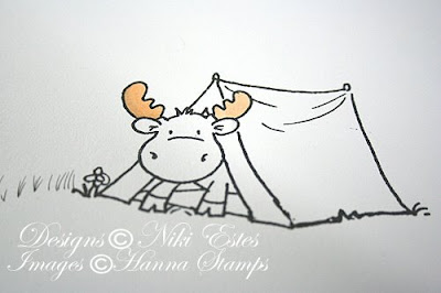 First, color the antler in with the lightest marker color. You can see how it's much lighter than what it will be when it is finished.
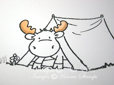 Next, create some shading using the second marker. It doesn't look very good yet because it isn't blended.
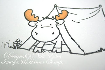 Blend the two colors together by going over the entire antler using the lighter marker until the colors are nicely blended. You can go over the area repeatedly because the marker won't pill the paper, which is one of the beauties of using an alcohol based marker. If you want more shading after you've blended the colors, you can add a little more of the darker marker by either touching the tip of the light marker to the dark one and coloring or just lightly add more with the darker marker. You can always go over them again if you don't like the results and you can make them lighter using the colorless blender marker (which takes color away).
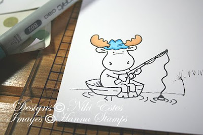 Color the antlers on the second moose. Then, color the Fishing Riley's hat with a light blue and add the shading with a darker blue.
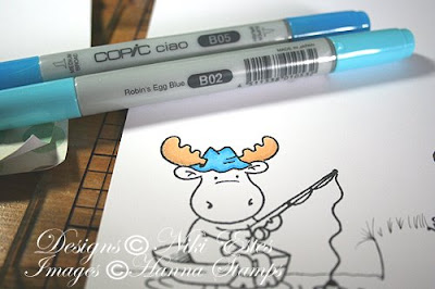 Blend the two blues the same way we did the antlers using the light blue marker.
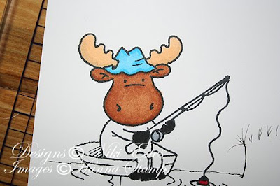 Color Riley's hooves using a black copic marker. Color the fishing bobber using a red marker and color Riley's head using brown markers. This is the look we are going for with Riley's body (just for reference).
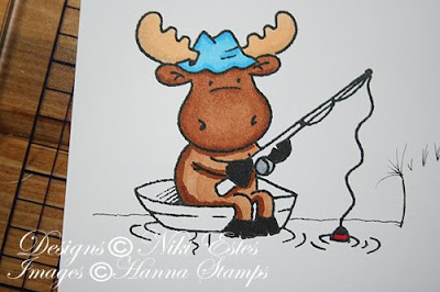 (None of the photos show the brown markers I use, but I usually use E33 and E37 when coloring my moose and that is what I am using here.) Start coloring Riley's head and body by coloring first with the light brown. Shade with the darker marker.
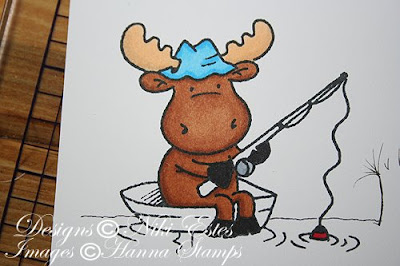 Blend using the lighter brown marker. After blending, if you need to, add more shading using the darker marker.
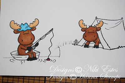 Color the Tent Riley using the same techniques (light color first, shade with darker color, blend with lighter color). Color his hooves black.
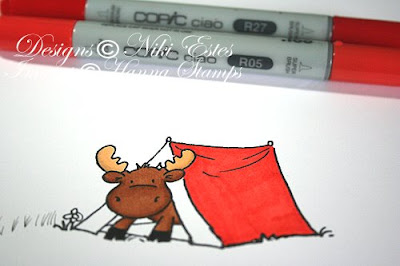 Next, I started coloring the tent. I colored the tent using my lighter color (R05). You can see that I'm not using markers close in shades, like say R02 and R04 (I don't know if those are real colors since I just made some up). Instead I'm using an orange red and a dark red. The reason it works is because you can blend so much by just adding another layer until it's how you like it.
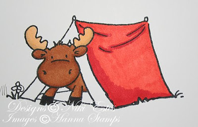 Add shading using the darker red (R27). I add shading where I think the shadows would be, like the lower part of the tent and the spots where the tent sags a bit.
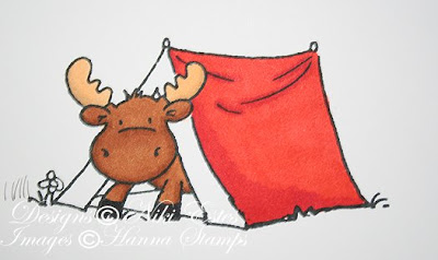 Blend by going over the image using the lighter marker. This is after one layer with the lighter marker. You can see that it needs to be blended more where the shading is so just go over it again until it looks nicely blended.
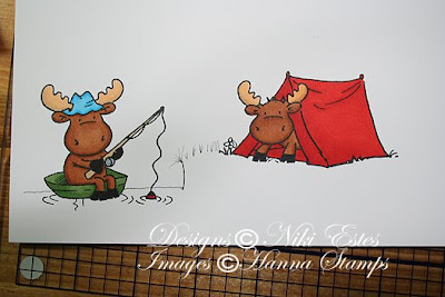 Color the rest of the tent and Fishing Riley's boat using the same process.
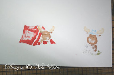 I thought I would show you what the back of my cardstock looks like at this point. Even with very thick cardstock, the back of your cardstock should look like this if you are blending enough.
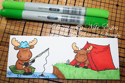 I cut out my image before I started color the water and grass so that I wouldn't be wasting ink. I used my copic multiliner pen to add more grass and lines in the river bank. Next, color your water around the boat using light and dark markers. I added shading where the water ripples, under the boat and at the water line by the river bank. Then, I colored the river bank using two brown markers. For the grass, start the same way by coloring it with the light green.
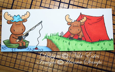 Shade using the darker green marker. I added some darker green to my grass that I drew in with the copic multiliner pen and under the tent.
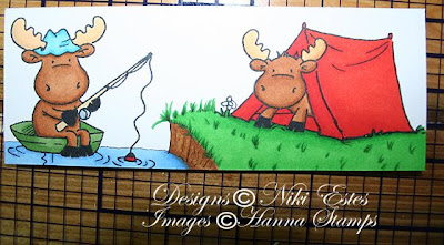 Blend the greens by going over them with the lighter green marker until it is well blended. Go back with the darker green marker to add a little more to the grass and right under the tent.
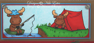 Last step is the sky. Go over the entire sky using small circular movements using a blue marker (usually I use B00 like I did here). Then, go over the sky using the colorless blender to blend the area. It will take away some of the color and make it look more even. If you end up with a spot that needs a little more color, touch the tip of your blender marker to the blue marker. That will give you a little bit of light blue that you can use to fill in the spot. You may need to touch the tips a few times to get it like you want it.
I would love to hear what you think and see your creations. If I need to be clearer about something or something doesn't make sense, please let me know. Thanks for stopping by and have a great day!

Recipe
Posted by Niki Estes at Thursday, May 22, 2008 32 comments
Labels: Cards, Hanna stamps, Tutorials
Wednesday, May 21, 2008
fun technique for you
 Today, I have a fun technique to share with you. It is so easy to do and adds such a great touch to your project. First, some card info. I started by making my card base out of white cardstock. Then, I random stamped with the lily pad image in Pond Life to create my patterned paper. I cut and matted my patterned paper before adding it to my card. Next, I cut out my circles using nestability dies. I stamped my frog, added the sentiment (I masked two stamps from the sentiment set to create my sentiment), and image to my card. Last, I added some dimensional glaze to the frog to make him nice and shiny. Now, for the fun technique.
 See how my frog has that cool pattern all over his body. It is so easy to create. This is called stamp kissing. It's certainly not a new technique, but it's still a fun one to use. I simply inked up my stamp, stamped on a sponge (just a regular household sponge), and then stamped my frog on my cardstock circle. I love how it looks like the pattern you see on so many real frogs. I added some dimensional glaze over my frog and let it dry. Between the pattern and the glaze, I think it makes the frog look more realistic.
 There are so many options out there using this technique to add texture and another dimension to your stamps. I'd love to see what you come up with if you try this technique.
Have a great day!

Posted by Niki Estes at Wednesday, May 21, 2008 8 comments
Labels: Cards, Papertrey stamps
Tuesday, May 20, 2008
birthday fishes and belated father's day

 I added dimensional glaze to the fish bubbles to make them stand out a little more against the water background.
 I started this card by stamping my turtle on a white piece of cardstock that I had cut out with a nestability die. Then, I matted my image. I created my card base from Spring Moss cardstock and cut two patterned paper slightly smaller than my card base. I added the spring moss twill to the patterned papers before adding them to my card base. Next, I added my turtle image to my card. I stamped my sentiment by masking two of the sentiments in the Pond Life set. Then, I cut my sentiment out with a die and matted it before adding it to my card.
 I used the dimensional glaze again on this card to make the turtle's shell and eye stand out more.
Recipe for first card
Stamps: Pond Life, Pond Life sentiments (Papertrey Ink)
Cardstock: white stamper's select, summer sunrise (Papertrey Ink), blue (DCWV)
Ink: summer sunrise (Papertrey Ink), noir, seascape (Palette), versamark
Accents: summer sunrise ribbon (Papertrey Ink)
Tools: corner rounder, slot tool (Making Memories), heat gun, embossing powder, sponge dauber
Recipe for second card
Stamps: Pond Life, Pond Life sentiments (Papertrey Ink)
Ink: spring moss (Papertrey Ink), landscape, noir (Palette)
Cardstock: white stamper's select, spring moss (Papertrey Ink)
Patterned Paper: Father Know's Best
Accents: spring moss twill (Papertrey Ink), dimensional glaze
Tools: nestability dies
Posted by Niki Estes at Tuesday, May 20, 2008 4 comments
Labels: Cards, Papertrey stamps
Monday, May 19, 2008
Papertrey Flowers
Here are the last of my flower cards I made for the Papertrey GSS contest. I have a few other cards left to share, but no more flower ones.


Here is a close up of the button. I think it adds something extra to the card by making a custom button.
Recipe for first card
Stamps: Garden of Life (Papertrey Ink)
Cardstock: white Stamper's Select, sweet blush (Papertrey Ink)
Ink: sweet blush (Papertrey Ink), landscape, noir (Palette)
Accents: sweet blush swiss dots ribbon (Papertrey Ink)
Tools: copic spica glitter pen, cuttlebug die, nestability die, sewing machine, slot tool (Making Memories)
Recipe for second card
Stamps: Garden of Life (Papertrey Ink)
Ink: noir (Palette), summer sunrise (Papertrey Ink), staz on
Cardstock: white stamper's select, summer sunrise (Papertrey Ink), black (SU!)
Tools: black stickles (Ranger), poly shrink, corner rounder, copic marker
Posted by Niki Estes at Monday, May 19, 2008 8 comments
Labels: Cards, Papertrey stamps

